Ode to ray-traced spheres and Apple logos
Miscellaneous,
10/26/07
Continuing their excellent “Road to Mac OS X Leopard” series that looks at features of Leopard in historical context, AppleInsider posted this image of the Macintosh II from 1987:
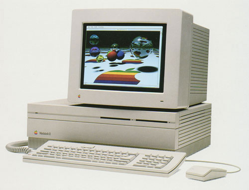
I got chills when I saw this—there is so much bound up in this image for me. I first caught a glance of it on the cover of Macworld magazine in Sawyer’s News in downtown Santa Rosa, while I was still in high school. We had a Mac Plus at home, and I had already spent some time doing experimental work on Macs and Amigas under the tutelage of John Watrous at Santa Rosa Junior College. At that time, many who hadn’t yet fallen under the Mac’s spell were fond of pointing out that the machine didn’t have a color display. Those of us who loved the Mac, however, were able to easily process this criticism as coming from people akin to those who thought black-and-white movies were boring; they just had no appreciation for culture, man!
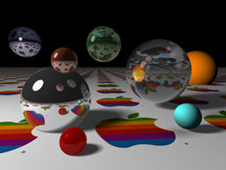
When I first saw the old rainbow Apple logo reflected with raytraced precision in the hovering silver spheres (not rendered on a Mac II, mind you, but on a Cray supercomputer), I felt simultaneously exhilarated and betrayed. I was exhilarated because the image meant that high-end graphics like those I had been seeing in numerous CG animation compilations (Sexy Robot, anyone?) were going to be in reach of a machine I might actually have access to. The feeling of betrayal came from a sense that Apple had somehow caved to the masses by offering color. It felt cheap. I remember wondering if the Mac interface would even work in color! Even the shape of the machine felt like a concession to the lowbrow. A big box? What happened to the elegant, compact all-in-one design, where even the various i/o port icons bore the stamp of greatness?
Not long afterwards, I got to spend some time with the box. The junior college had bought one, and while the machine was not located in the art department, John managed to get me a couple of hours alone with it. I still remember the smell of the room. I started poking around, getting a feel for how color had been worked into the OS. It started to sink in that this wasn’t a betrayal at all, it was where the machine needed to go, that the design intelligence was still there, and in fact now had a (literally!) greater palette through which to express itself.
And then I fired up Digital Darkroom. By that time, I had spent a couple years learning the art of one-bit pixel pushing in MacPaint (to hone my skills, over a few days one summer I dedicated myself to recreating corporate logos from Macworld advertisements in bitmap form). Having accommodated to the on/off world of early Mac image creation, to click on the water droplet tool and be able to—what?—actually smear graphics digitally was nothing short of a revelation. It would be another five years before I got consistent access to a color Macintosh, at The Voyager Company, but this image signaled the imminent arrival of a brave new world in desktop imaging.
A non-linear index for fiction and non-fiction RIAs, made possible with SpringGraph
Digital Humanities, Flex, Interactive Design,
10/25/07
The interactive index from Nation on the Move.
One of the things I’m most excited about with this latest issue of Vectors is the inclusion of a new “interactive index” feature which gives users non-linear, bookmarkable access to the databases for the projects Blue Velvet and Nation on the Move. My hope is that this feature, which allows you to visually browse each database’s contents through a common ThinkMap-style interface which is completely independent of the ‘designed’ front end of each project, will bring some transparency to our authoring and design practice at Vectors. I can easily see such an index becoming a standard feature for future interactive works, both fiction and non-fiction.
Well-deserved kudos for the technology behind the index go to Mark Shepherd, a Senior Computer Scientist at Adobe who developed the open-source SpringGraph Flex component that made it all possible. Thanks to his terrific implementation, I got the first version of the index up and running in just a few hours. It’s quite easy to use and really stunning (and fun) once you get some data hopping around in there.
The indexes included in the current issue of Vectors are still rather rudimentary, and any feedback or suggestions you have are most welcome. For future projects, I plan to integrate each index directly into the work itself, so it will truly start to function like the index in a printed book. I see this as just one component of an emerging set of user experience standards that will characterize fiction and non-fiction RIAs in the immediate future.
Blue Velvet: the architecture of poetry
Digital Humanities, Interactive Design,
10/20/07
The following is the designer’s statement from Blue Velvet, one of the projects in the Difference issue of Vectors that launched this week.
Music is a much more direct ancestor to interactive media than cinema. The mathematical and logical frameworks, the use of score as a generative source, the importance of live performance—all find strong parallels in digital interactivity. Poetry, too, shares many of these qualities, and in my experience authors with a poetic sensibility are often the ones who feel the greatest sense of liberation as they engage interactive platforms.
Scholars like David Theo Goldberg, who possess an innate predilection for the poetic, frequently find that their more fanciful instincts, which may be quashed in other formats, can be expressed more freely here. Of course, freedom in this medium, as in the other arts, frequently thrives within well-defined limitations. In interactive media, a good content architecture—realized in most Vectors projects in the form of a database—fulfills this role, taking account of the territory it is meant to represent and shutting down unproductive structural avenues while encouraging the fruitful ones. If all goes well, the author gains an expressive scaffold which resonates with the ideas at hand.
The database design for Blue Velvet initially suffered from overconnectedness—too many kinds of things were linked in too many ways. The common result in this situation is that author and user alike become confused about what they are supposed to be doing. Stefka Hristova was instrumental in identifying these kinds of problems and suggesting solutions. Through collaborative pruning and condensing of the structure, amplified in our case by the decision to give the work a linear spine, we were able to identify and foster a regular rhythm for the interaction—an oscillation between above ground and underwater, placidity and turmoil, complacency and catastrophe.
The ways in which falling words “dissolve” and reconfigure themselves in the piece was a structural conceit designed to give David the chance to explore something I kept hearing during our phone conversations: his penchant for wordplay. He would frequently substitute the expected word in a sentence with a similar word that threw an (often humorous) twist into the idea being expressed. Taking inspiration from this trait, I came up with a database structure that would allow David to define how words would break apart and transform. David took to the concept immediately, which was very gratifying, and resulted in some inspired word associations.
A final note: Blue Velvet includes an interactive index—an experiment in making the underlying structures of Vectors projects more accessible to the public. Using the index, you can browse the project’s database visually and bookmark specific elements for citation purposes. The piece itself remains the preferred way of accessing David’s work, but we hope elements like the index and video tutorial will help to bring Vectors projects to a wider audience.
Recent Posts
Go InSight: Composing a Musical Summation of Every Mission to Mars (Part 2)
Making music out of the data of interplanetary exploration.
Go InSight: Composing a musical summation of every mission to Mars (Part 1)
Making music out of the data of interplanetary exploration.
Cited Works from “Storytelling in the Age of Divided Screens”
Here’s a list of links to works cited in my recent talk “Storytelling in the Age of Divided Screens” at Gallaudet University.
Timeframing: The Art of Comics on Screens
I’m very happy to announce the launch of “Timeframing: The Art of Comics on Screens,” a new website that explores what comics have to teach us about creative communication in the age of screen media.
The prototype that led to Upgrade Soul
To celebrate the launch of Upgrade Soul, here’s a screen shot of an eleven year old prototype I made that sets artwork from Will Eisner’s “The Treasure of Avenue ‘C’” (a story from New York: The Big City) in two dynamically resizable panels.
Categories
Algorithms
Animation
Announcements
Authoring Tools
Comics
Digital Humanities
Electronic Literature
Events
Experiments
Exemplary Work
Flash
Flex
Fun
Games
Graphic Design
Interactive Design
iPhone
jQuery
LA Flash
Miscellaneous
Music
Opertoon
Remembrances
Source Code
Typography
User Experience
Viewfinder
Wii
Archives
July 2018
May 2018
February 2015
October 2014
October 2012
February 2012
January 2012
January 2011
April 2010
March 2010
October 2009
February 2009
January 2009
December 2008
September 2008
July 2008
June 2008
April 2008
March 2008
February 2008
January 2008
November 2007
October 2007
September 2007
August 2007
July 2007
June 2007