Nation on the Move: entropic agents at work
Digital Humanities, Interactive Design,
10/19/07
The following is the designer’s statement from Nation on the Move, one of the projects in the Difference issue of Vectors that launched this week.
Interfaces are often marketed as filters that help to distinguish signal from noise in an information-saturated environment. They enable us, we are told, to reveal messages that would have otherwise been hidden in clutter; they allow us to make information more appealing by removing traces of the things which disinterest us.
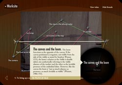
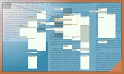
In Nation on the Move, our goal was the opposite: instead of rendering complicated things simple, Minoo Moallem and I wanted to trouble simplicity with disorder. Over the course of the piece, a single thread is pulled, teased and stretched into a chaotic web of interconnections between ideas of nationhood, gender, commerce and art that comprise the world of the Persian carpet. At the heart of the work is an acknowledgment of the essential impossibility of “sorting out” these relationships into some well-defined hierarchy.
Paradoxically, this rhetorical strategy is the result of careful interpretation of the extreme orderliness of the database which drives the project. This database is comprised of “panels” defining each image and video clip the user sees. Each panel contains active locations called “sites” at which one or more pieces of content may live. Each piece of content is then assigned a thematic “thread” which ends up being rendered as a literal thread in the visual presentation. As the user progressively reveals the content of the piece, these threads become more and more jumbled.
The chaotic trajectories of the threads arise from two factors. The first is that our foundation visual element is the image, which we treat as a 2D landscape containing short texts at specific locations suggested by the image content. Since the individual images have no relationship to each other in their composition, the texts end up being laid out in a fashion which appears almost random. The second factor is the visual persistence of the threads, which are constrained to pass through the location of each bit of content to which they are linked. The combination of these elements ensures that once the user has explored a majority of the images she will be faced with a tangle of threads anchored by content which seems to be laid out at random.
The seeming chaos of the piece is thus quite designed, as it often is in the digital realm. Unlike the physics of disarray we’re accustomed to encountering in the physical world, in the digital world content creators are frequently cast in the role of entropic agents, adding measured amounts of chaos in an attempt to hit the “sweet spots” of human perception. To see a visual representation of the order which the project transmutes into chaos, take a look at the project’s interactive index, an experiment in making the underlying structure of Vectors projects more accessible to the general public. The index is a graphical browser of the Nation on the Move database in which individual elements can be bookmarked for review or citation purposes. Our hope is that features like the index and the project’s video tutorial will help bring greater transparency to our practice and product.
Vectors’“Difference” issue launched
Announcements, Digital Humanities,
10/16/07
I’m very happy to announce that “Difference,” the latest issue of Vectors: Journal of Culture and Technology in a Dynamic Vernacular, is now live. Featuring seven new multimedia projects created in collaboration with a wide array of cutting-edge scholars, it’s a wonderfully diverse collection of works covering topics ranging from the war in Iraq to WiFi networks to Persian carpets. I contributed to two of the projects, “Blue Velvet” and “Nation on the Move,” as designer and programmer—deepest thanks to David Theo Goldberg and Minoo Moallem, respectively, for the opportunity to collaborate in such exciting ways.
I’ve excerpted each project’s peer response below to provide a quick overview of the issue’s contents—take a deep breath, and dig in!
“‘Blue Velvet: Re-Dressing New Orleans in Katrina’s Wake’ is a provocative engagement, in all senses of this term, with the ways that neo-liberal policies and the politics and economics of race and class, historical and contemporary, are literally remapping the meaning of the city. A project that is as much aural as visual, ‘Blue Velvet’ defies linearity of time and of narrative while it simultaneously immerses the site’s users in a topsy-turvy environment.”
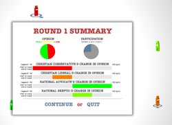
“The ‘Deliberative Democracy and Difference’ project illustrates a devastating tension between the normative dreams of deliberative democrats and the nitty-gritty realities of actual political discussion. Deliberative democrats’ aim of using procedural rules to ensure a discursive environment of fairness, equality and civility is compelling as an ideal arrangement for ensuring democratic governance. In practice, however, it runs up against the problems of who participates in discussion, and how that participation takes place.”
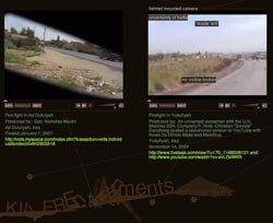
“A project like ‘Killer Entertainments,’ by Jenny Terry and Raegan Kelly, is necessary in a time of war. This project recalls the response of many reporters, teachers and activists to the Vietnam War. That historical antecedent is crucial because we are addressing many of the same issues as forty years ago with our current military involvement in Iraq. ‘Killer Entertainments’ builds upon the Vietnam War’s legacy of gonzo journalism and teach-ins while using new approaches to scholarship and technologies.”
“This is a fascinating interactive essay that richly benefits from the interactive form. It is dense, deeply interconnected, and provocative. The interface ... questions the need for a basic unchanging knowledge matrix, and in this liberty it is able to spin new connections. ‘Nation on the Move’ is about carpets, but it is structured more like a spider web or a crazy quilt. This is wonderfully shown in the Index, where specific concepts like ‘the body’ show their shifting relation to contents and themes in a dynamic web-like interface.”
“‘Programmed Visions’ presents a tension between the indexical, that which is purely information, and an aesthetics of information. As mediation, it creates a sense of vertigo and a chase. If I touch or move can I still grasp this archive? Can I get it all? How is it held? The slippery motion is indicative of Chun’s point about the semiotics and ideology of race.”
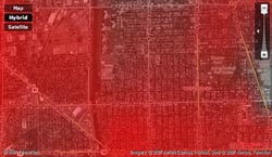
“Hence the idea for ‘Rendering Electromagnetic Distribution’ (RED): it turned out that the detailed demographics of these neighborhoods ‘a weighted combination of race, age, income, education and density’ explained much of the variation in Wi-Fi activity. So the RED team designed an interactive map generator that uses demographic information to predict how much Wi-Fi use should be expected in a given place. RED depicts Wi-Fi as a scarlet haze floating over the city, denser where use is greater.”
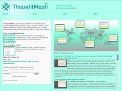
”...‘ThoughtMesh,’ a dynamic and compelling mode of structuring and interlinking scholarly texts via shared tags. The combination of a simple user interface with a system of both automatically and manually generated tags that serve as links across all of the texts in the “mesh” results here in a compelling means of reorganizing scholarly publishing as a community-based, rather than individual, activity, one that recognizes the foundations of such publishing in open, mobile discourse.”
A long, winding (and fascinating) “Road” at AppleInsider
Interactive Design,
10/11/07
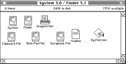
A quick update: I wanted to call attention to a great series of articles on AppleInsider previewing interface novelties in the upcoming Leopard incarnation of Mac OS X. This isn’t your usual Apple fanboy boosterism, however—each article places a single new feature of the OS in historical context, with screenshots from earlier operating systems (I find the comparisons with NeXTSTEP particularly interesting).
Here are links to the articles published in the “Road to Mac OS X Leopard” series to date:
Road to Mac OS X Leopard: Finder 10.5
Road to Mac OS X Leopard: Dock 1.6
Road to Mac OS X Leopard: Spaces
Road to Mac OS X Leopard: Time Machine
Road to Mac OS X Leopard: Mail 3.0
Road to Mac OS X Leopard: iChat 4.0
Road to Mac OS X Leopard: iCal 3.0
Road to Mac OS X Leopard: Safari 3.0
Recent Posts
Go InSight: Composing a Musical Summation of Every Mission to Mars (Part 2)
Making music out of the data of interplanetary exploration.
Go InSight: Composing a musical summation of every mission to Mars (Part 1)
Making music out of the data of interplanetary exploration.
Cited Works from “Storytelling in the Age of Divided Screens”
Here’s a list of links to works cited in my recent talk “Storytelling in the Age of Divided Screens” at Gallaudet University.
Timeframing: The Art of Comics on Screens
I’m very happy to announce the launch of “Timeframing: The Art of Comics on Screens,” a new website that explores what comics have to teach us about creative communication in the age of screen media.
The prototype that led to Upgrade Soul
To celebrate the launch of Upgrade Soul, here’s a screen shot of an eleven year old prototype I made that sets artwork from Will Eisner’s “The Treasure of Avenue ‘C’” (a story from New York: The Big City) in two dynamically resizable panels.
Categories
Algorithms
Animation
Announcements
Authoring Tools
Comics
Digital Humanities
Electronic Literature
Events
Experiments
Exemplary Work
Flash
Flex
Fun
Games
Graphic Design
Interactive Design
iPhone
jQuery
LA Flash
Miscellaneous
Music
Opertoon
Remembrances
Source Code
Typography
User Experience
Viewfinder
Wii
Archives
July 2018
May 2018
February 2015
October 2014
October 2012
February 2012
January 2012
January 2011
April 2010
March 2010
October 2009
February 2009
January 2009
December 2008
September 2008
July 2008
June 2008
April 2008
March 2008
February 2008
January 2008
November 2007
October 2007
September 2007
August 2007
July 2007
June 2007
