The slabtype algorithm, Part 1: Background
Algorithms, Flash, Graphic Design, Interactive Design, Typography,
1/23/08
Animator/designer Alessandro Ceglia pointed out to me a few months back that it’s possible that many users of Public Secrets don’t realize that the piece’s visual presentation is almost entirely algorithmic. Once you get beyond the title screen, all visual composition is handled dynamically, and you’ll never be able to take two identical screenshots of the piece. The designer’s statement for the project describes the two main algorithms used in the project: treemaps (an existing solution dating back to 1991) and an original text-layout algorithm which as of this article is dubbed “slabtype.”
Treemaps (which I fell in love with after seeing Martin Wattenberg’s Map of the Market while I was working at Razorfish) are covered extensively elsewhere (description, history, Wikipedia) and are used to generate the overall layout of boxes for each screen of the piece. In this four-part series of posts I’m going to present a graphical breakdown of the slabtype algorithm responsible for laying out the text and quotations which appear inside the boxes (source code will be provided in the final post).
As the design process for Public Secrets began to lead Sharon Daniel and I back towards her original idea of making the treemap algorithm a central metaphor of the piece, it became clear that we could really use some aesthetically pleasing way of dynamically placing arbitrary amounts of text inside a box. Early designs organized the statements of the incarcerated women as collections of titles, but ultimately these approaches were rejected as too index-like and lacking in emotional power.
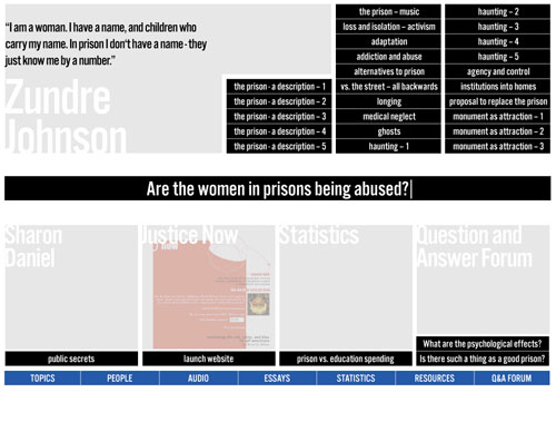
An early, more index-like design for Public Secrets.
A subsequent design hit upon what later became our “split” view, which runs text along an arbitrary rectilinear dividing line between halves of a binary. The dividing line was shown to organize the space on either side into rectangular blocks in which text was laid out along the borders of squares. The idea was intriguing, and I started writing some pseudocode to work out how to fit the text to the border: the program would make a “best guess” at the relative point sizes needed and then refine the guess iteratively. The algorithm was never finalized, however, as it was clear that the type was too hard to read in this configuration.
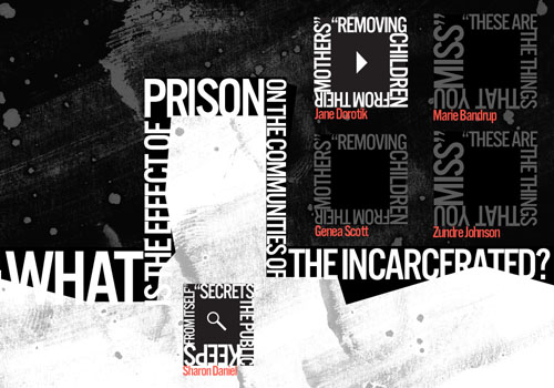
The “split” view, featuring text running around the borders of boxes.
Further exploration led to a new tack in which the text associated with a particular box was chopped up and resized into a slab that approximated the shape of its enclosing rectangle. This method seemed to add an urgent quality to the quotes and supported an approach in which the quotes themselves were the primary visual experience of the piece—dovetailing nicely with Sharon’s original intent to foreground the voices of the women.
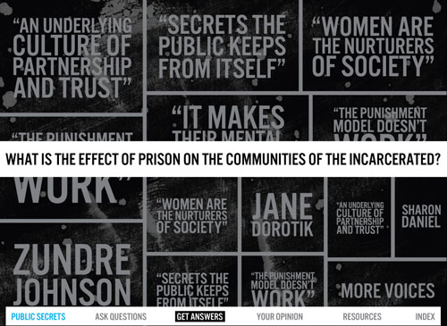
A mockup of the approach that became the model for the slabtype algorithm.
The above screen was assembled by hand in Illustrator and Photoshop, but after Sharon agreed that this approach held promise, I started working on the algorithm itself.
Next: The slabtype algorithm, Part 2: Initial calculations
Introducing “Generous Machine”
Announcements,
1/19/08
“These machines… They must be generous with our needs. They must be forgiving with our errors. They must be eloquent of ourselves.”
—Grid Farmer Perry, in Chapter Seven of Chroma
Today marks the debut of “Generous Machine,” a freshly minted moniker for this site, and a new domain (generousmachine.com) that points to it. (erikloyer.com will continue to work as well.) I’ve been kicking around the idea of blogging under a title for a few months now, and the right one finally came along over the holidays. For me, this title instinctively evokes my favorite interactive works, and so represents both the best experiences of the past as well as my aspirations for the future. I’ll be returning to developing original content this year—and the “generous machine” will be one standard to be aimed for.
Cheers!
Fixed perspective in games: the enemy of tears?
Games, Interactive Design,
1/16/08
Just before Christmas, Chris Hecker posted a transcription of the 1982 print advertisement that introduced Electronic Arts to the world: “Can a computer make you cry?” This piece has become a touchstone among digital experience creators, crystallizing as it does our aspirations to be considered artists in the hope-when-I’m-old-they-give-me-a-lifetime-acheivement-award sense. Steven Spielberg himself implicitly invoked the ad at the 2004 opening of the EA Game Lab at USC (an event I captured on my cell phone camera, albeit poorly).
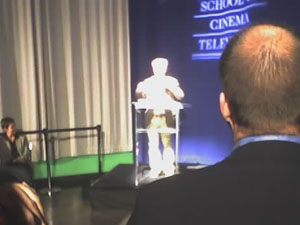
Trust me. This is a picture of Steven Spielberg.
Twenty-five years after the publication of the ad, many gamers are able to recollect a small number of interactive experiences that provide ready and affirmative answers to the question posed by the ad. While many of these remembrances forego actual weeping, I think it’s reasonable to adopt Janet Murray’s position that the phrase “‘make us cry’ stands for a set of phenomena that do not have to involve actual tears” but more broadly engender heightened emotional engagement. A 2005 study identifies the death of Aeris in Final Fantasy VII as one of the most often cited moments. (I’ve never really gotten into the Final Fantasy series; my pick would be the bridge scene in Ico.)
I think there’s a lot of factors that play into whether a particular digital experience will “make us cry.” A lot of it has to do with the propensities of the user in the first place—most of those reporting high emotional engagement with interactive fiction are those who very much desire to experience such engagement, and to demonstrate that their chosen medium is capable of it. That willingness forgives a multitude of sins, which may include poor writing and acting, low resolution, simplistic characterization, and pandering to the wish-fulfillment impulse.
It also frequently forgives the fixed perspective. Cinema is widely understood to have come into its own as a medium once directors began to liberate themselves from proscenium framing (which placed the camera in the position of an audience member for a play) and began to put the camera in artistically optimal positions, using editing to string the various viewpoints together to achieve a particular effect. Games have their own version of the proscenium—a fixed point of view which is adopted throughout the interactive portions of the game. This fixed perspective arose as a matter of necessity: first a technical necessity (it’s much easier to create games in limited computing environments by restricting point of view) and then a design necessity (it’s much easier for people to learn how to interact with a virtual environment when their point of view is fixed).
As computing power has increased, the first necessity has generally fallen away, while the second remains strongly in force. Contemporary games with dynamic or interactive camera systems offer much greater variation in the range of perspectives offered to the user during play (i.e. not during a cut scene), but this variation is motivated almost exclusively by utility, with the goal of providing the optimal viewpoint for the player to carry out their tasks. It’s still rare to find games in which perspective is manipulated with artistic intent during play, mainly because experiences which tie interface strictly to a single avatar enforce restrictions on scale and perspective that are tough to get around. In a Tomb Raider game, if you suddenly cut to an extreme close-up of Lara Croft’s eye for artistic effect, the interface you were using to navigate her through her environment suddenly has no meaning. Either you’ve got to teach the player a new interface right then and there for controlling her eye (which may not even make sense artistically), or you temporarily turn off the interactivity (which leaves you with a cut scene).
The other factor that limits options for perspective in games is the widely-accepted design principle that difficulty must increase over the course of the experience. This is actually quite a curious phenomenon when examined in relation to other media. Does a song become harder to listen to the closer you get to its end? Do books become harder to read? Do movies become harder to watch? This one idea has a profound effect on the artistic potential of the medium, because the assumption that the user must learn a task that becomes progressively harder by default requires that the basic elements used to “stage” that task must remain constant. I can’t get better at controlling Lara Croft if my perspective on her is always radically changing; therefore all the artistic potential bound up in multiple points of view is discarded to satisfy the requirements of the learning curve.
The Nintendo DS and Wii have given us many examples of games which teach interface on the fly (with Wario Ware being the most hyperactive). If handled correctly, users enjoy these shifts; what’s needed is to locate them in interactive environments in which emotion—not difficulty or consistency—is the prime mover of the experience. This might speed the day when when games that “made us cry” (or more precisely, engaged our emotions) can be counted on more than one hand by more than just hardcore gamers.
Recent Posts
Go InSight: Composing a Musical Summation of Every Mission to Mars (Part 2)
Making music out of the data of interplanetary exploration.
Go InSight: Composing a musical summation of every mission to Mars (Part 1)
Making music out of the data of interplanetary exploration.
Cited Works from “Storytelling in the Age of Divided Screens”
Here’s a list of links to works cited in my recent talk “Storytelling in the Age of Divided Screens” at Gallaudet University.
Timeframing: The Art of Comics on Screens
I’m very happy to announce the launch of “Timeframing: The Art of Comics on Screens,” a new website that explores what comics have to teach us about creative communication in the age of screen media.
The prototype that led to Upgrade Soul
To celebrate the launch of Upgrade Soul, here’s a screen shot of an eleven year old prototype I made that sets artwork from Will Eisner’s “The Treasure of Avenue ‘C’” (a story from New York: The Big City) in two dynamically resizable panels.
Categories
Algorithms
Animation
Announcements
Authoring Tools
Comics
Digital Humanities
Electronic Literature
Events
Experiments
Exemplary Work
Flash
Flex
Fun
Games
Graphic Design
Interactive Design
iPhone
jQuery
LA Flash
Miscellaneous
Music
Opertoon
Remembrances
Source Code
Typography
User Experience
Viewfinder
Wii
Archives
July 2018
May 2018
February 2015
October 2014
October 2012
February 2012
January 2012
January 2011
April 2010
March 2010
October 2009
February 2009
January 2009
December 2008
September 2008
July 2008
June 2008
April 2008
March 2008
February 2008
January 2008
November 2007
October 2007
September 2007
August 2007
July 2007
June 2007