What is casual significance?
Exemplary Work, Interactive Design, Music,
8/3/07
Casual significance is when easy-to-read things point to hard-to-grasp things. Like the taste visualization in Ratatouille. Or Different Trains. Or the color organ in Close Encounters of the Third Kind. They take a stab in the dark, doing things you’d like to build theories around but shouldn’t, and as such they enable you to walk into the unknown with joy and confidence.
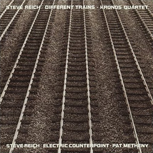
I admire Steve Reich’s Different Trains as much as any piece of music written in the latter half of the 20th century because it speaks in a unique language that’s totally specific to its content and yet whose fluency is easy to adopt and understand. Even though it contains constant abrupt shifts in tempo and harmony, even though it takes a programmatic stance on the connection between speech and melody, even though it references the Holocaust, it succeeds in doing all of these things simultaneously while remaining highly accessible to the untrained ear.
My kids have heard the first, joyful movement of Different Trains, and they love it. They enjoy the voices, the repetition, the rhythms, the sound effects, even though it’s like no other piece of music they’ve ever heard. They haven’t been exposed to the subsequent movements yet, and they have no concept of the overall theme of the work, but it’ll be waiting for them when they’re ready, and what will pull them towards it is simply the way in which the work’s strategies unfold in time. That’s casual significance.
So what would casual significance look like in the interactive arena? We’re quickly becoming surrounded by the casual; EA recently stated that they see the casual market as the biggest opportunity in gaming. Most of these games are fun diversions and nothing more, which is fine. The burgeoning “serious games” market is definitely a kind of casual significance, but significance in that context is usually defined solely as social responsibility. I wholly support the growth of serious games, but that’s not really what I’m talking about here.
No, when I talk about casual significance I’m talking about easy-to-read interactive experiences that point to the mysteries of the human condition. Those mysteries might be sensual, or spiritual, or philosophical, and the goal of the experience is not to teach a class about them, but simply to point to them. I love how visual music and synaesthetic works tend to put you in this space instantly and almost effortlessly.
Shining Flower, the CD-ROM I profiled last week, is probably my favorite existing example of this in the interactive realm (though its actual interactivity is meager), as it nails the M.O. of casual significance—simple things pointing to deeper things. Fumito Ueda’s Ico and Shadow of the Colossus come close, but as much as I admire them I think their game mechanics are too prominent to truly classify them as “casual” experiences.
Works of casual significance are high on aesthetics and groove, low on guilt and training, and they index hidden depths. They’re what I wish I was playing when I play the Wii.
Shining Flower: an appreciation
Exemplary Work,
7/27/07
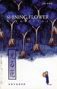
Pictured at right: the cover of one of my all-time favorite digital experiences, the almost completely non-interactive Shining Flower (aka Hikaru Hana), developed by Maze Inc. and published by The Voyager Company, with concept and illustrations by Kikuko Iwano. My niece (those are her cornrows you see at the bottom of every page) recently returned to me the Power Macintosh 8500/120 I lent her when she went to college, and with it I regained the ability to run Shining Flower, to my delight.
Shining Flower was published in 1993 while I was working at Voyager as an audio commentary editor for the Criterion Collection. I have vague memories of seeing it demoed at one of the monthly open houses Voyager held at their offices on the beach at Santa Monica. Love at first sight; that immediate feeling of creative jealousy you get when you see something you wish you’d made. I bought it.
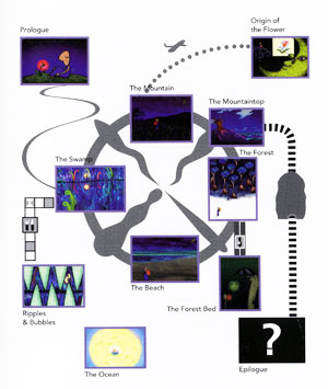
Shining Flower is beautiful, contemplative, quiet, and makes excellent use of limited resources. It’s not pretending to be a movie, or cel animation, or anything other than an 8-bit Director piece (with exemplary use of the lost art of color cycling, I might add). A single character holding a glowing flower makes his/her way through a series of surreal vignettes, on a kind of spiritual journey. Interactivity is limited to basically choosing which several-minute-long sequence you want to watch next.
I remember some grumbling at Voyager about the lack of interaction; at a company which was pioneering the application of same to content of cultural significance, why publish this? On the surface, it did appear to be a misstep, but if you caught the spirit behind this piece—the total commitment to expressing something in this medium, approaching it with the same respect afforded to cinema or literature, fully embracing the technology of the day without harboring self-defeating disdain for its limitations—the appeal of the work was undeniable.
Now when I watch it I find myself wanting to write code that makes it all dynamic, semantic, syntactic and syllabic…
Enjoy: the “beach” vignette of Shining Flower.
Wiimote tutorial best practices: “Zack & Wiki”
Exemplary Work, Games, Wii,
7/20/07
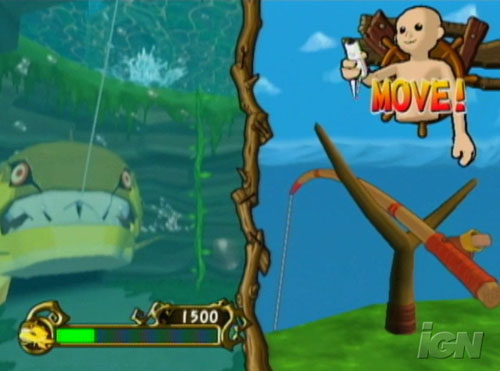
One of the things that’s apparent in this first generation of Wii titles is that many developers have underestimated how much attention needs to be given to instructing the user in how to hold and move the controller. Static icons don’t cut it anymore; you’ve got to have animation, and even then it takes some finesse, as simply playing a loop of the controller being waved around can still be confusing if the loop point itself unintentionally conveys some kind of gesture.
The best in-game controller tutorials I’ve seen to date are in the upcoming title Zack & Wiki. They actually show a little 3D animated guy (upper body only) holding the remote, along with text prompts. Seems like overkill at first, but it’s actually great because you not only pick up on controller movement, you also get posture and timing. When necessary, they can also switch to a first person view of the figure, or even a “disembodied hand” view to aid with object manipulation. Check out some videos of the interface in action, the game does look pretty fun.
I wonder, though, you think they’ll let you customize the guy’s skin color? I’m assuming he’s not a character in the game but is supposed to represent some kind of abstracted ideal human, which opens up a whole set of issues… many of which Anne Friedberg and I also ran into when picking silhouettes for The Virtual Window Interactive (and which we tried to skirt by letting users create their own). Gestural interfaces are increasingly going to require representation of the human form to explain, so whose form do we represent? Do we need an interactive 3D update to the 1974 AIGA/DOT symbol system?
Recent Posts
Go InSight: Composing a Musical Summation of Every Mission to Mars (Part 2)
Making music out of the data of interplanetary exploration.
Go InSight: Composing a musical summation of every mission to Mars (Part 1)
Making music out of the data of interplanetary exploration.
Cited Works from “Storytelling in the Age of Divided Screens”
Here’s a list of links to works cited in my recent talk “Storytelling in the Age of Divided Screens” at Gallaudet University.
Timeframing: The Art of Comics on Screens
I’m very happy to announce the launch of “Timeframing: The Art of Comics on Screens,” a new website that explores what comics have to teach us about creative communication in the age of screen media.
The prototype that led to Upgrade Soul
To celebrate the launch of Upgrade Soul, here’s a screen shot of an eleven year old prototype I made that sets artwork from Will Eisner’s “The Treasure of Avenue ‘C’” (a story from New York: The Big City) in two dynamically resizable panels.
Categories
Algorithms
Animation
Announcements
Authoring Tools
Comics
Digital Humanities
Electronic Literature
Events
Experiments
Exemplary Work
Flash
Flex
Fun
Games
Graphic Design
Interactive Design
iPhone
jQuery
LA Flash
Miscellaneous
Music
Opertoon
Remembrances
Source Code
Typography
User Experience
Viewfinder
Wii
Archives
July 2018
May 2018
February 2015
October 2014
October 2012
February 2012
January 2012
January 2011
April 2010
March 2010
October 2009
February 2009
January 2009
December 2008
September 2008
July 2008
June 2008
April 2008
March 2008
February 2008
January 2008
November 2007
October 2007
September 2007
August 2007
July 2007
June 2007