The slabtype algorithm, Part 1: Background
Algorithms, Flash, Graphic Design, Interactive Design, Typography,
1/23/08
Animator/designer Alessandro Ceglia pointed out to me a few months back that it’s possible that many users of Public Secrets don’t realize that the piece’s visual presentation is almost entirely algorithmic. Once you get beyond the title screen, all visual composition is handled dynamically, and you’ll never be able to take two identical screenshots of the piece. The designer’s statement for the project describes the two main algorithms used in the project: treemaps (an existing solution dating back to 1991) and an original text-layout algorithm which as of this article is dubbed “slabtype.”
Treemaps (which I fell in love with after seeing Martin Wattenberg’s Map of the Market while I was working at Razorfish) are covered extensively elsewhere (description, history, Wikipedia) and are used to generate the overall layout of boxes for each screen of the piece. In this four-part series of posts I’m going to present a graphical breakdown of the slabtype algorithm responsible for laying out the text and quotations which appear inside the boxes (source code will be provided in the final post).
As the design process for Public Secrets began to lead Sharon Daniel and I back towards her original idea of making the treemap algorithm a central metaphor of the piece, it became clear that we could really use some aesthetically pleasing way of dynamically placing arbitrary amounts of text inside a box. Early designs organized the statements of the incarcerated women as collections of titles, but ultimately these approaches were rejected as too index-like and lacking in emotional power.
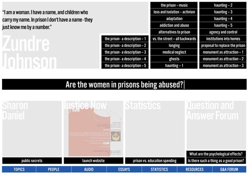
An early, more index-like design for Public Secrets.
A subsequent design hit upon what later became our “split” view, which runs text along an arbitrary rectilinear dividing line between halves of a binary. The dividing line was shown to organize the space on either side into rectangular blocks in which text was laid out along the borders of squares. The idea was intriguing, and I started writing some pseudocode to work out how to fit the text to the border: the program would make a “best guess” at the relative point sizes needed and then refine the guess iteratively. The algorithm was never finalized, however, as it was clear that the type was too hard to read in this configuration.
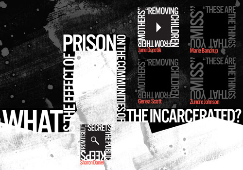
The “split” view, featuring text running around the borders of boxes.
Further exploration led to a new tack in which the text associated with a particular box was chopped up and resized into a slab that approximated the shape of its enclosing rectangle. This method seemed to add an urgent quality to the quotes and supported an approach in which the quotes themselves were the primary visual experience of the piece—dovetailing nicely with Sharon’s original intent to foreground the voices of the women.
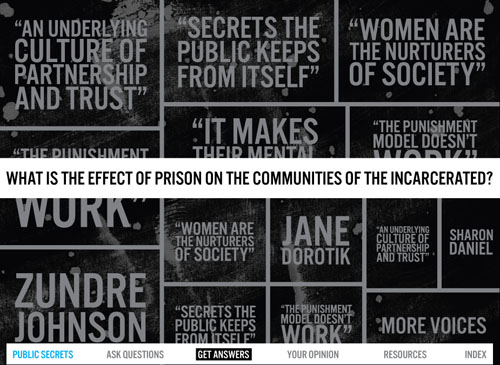
A mockup of the approach that became the model for the slabtype algorithm.
The above screen was assembled by hand in Illustrator and Photoshop, but after Sharon agreed that this approach held promise, I started working on the algorithm itself.
Next: The slabtype algorithm, Part 2: Initial calculations
Recent Posts
Go InSight: Composing a Musical Summation of Every Mission to Mars (Part 2)
Making music out of the data of interplanetary exploration.
Go InSight: Composing a musical summation of every mission to Mars (Part 1)
Making music out of the data of interplanetary exploration.
Cited Works from “Storytelling in the Age of Divided Screens”
Here’s a list of links to works cited in my recent talk “Storytelling in the Age of Divided Screens” at Gallaudet University.
Timeframing: The Art of Comics on Screens
I’m very happy to announce the launch of “Timeframing: The Art of Comics on Screens,” a new website that explores what comics have to teach us about creative communication in the age of screen media.
The prototype that led to Upgrade Soul
To celebrate the launch of Upgrade Soul, here’s a screen shot of an eleven year old prototype I made that sets artwork from Will Eisner’s “The Treasure of Avenue ‘C’” (a story from New York: The Big City) in two dynamically resizable panels.
Categories
Algorithms
Animation
Announcements
Authoring Tools
Comics
Digital Humanities
Electronic Literature
Events
Experiments
Exemplary Work
Flash
Flex
Fun
Games
Graphic Design
Interactive Design
iPhone
jQuery
LA Flash
Miscellaneous
Music
Opertoon
Remembrances
Source Code
Typography
User Experience
Viewfinder
Wii
Archives
July 2018
May 2018
February 2015
October 2014
October 2012
February 2012
January 2012
January 2011
April 2010
March 2010
October 2009
February 2009
January 2009
December 2008
September 2008
July 2008
June 2008
April 2008
March 2008
February 2008
January 2008
November 2007
October 2007
September 2007
August 2007
July 2007
June 2007