The slabtype algorithm, Part 2: Initial calculations
Algorithms,
Flash,
Graphic Design,
Interactive Design,
Typography,
1/24/08
This is the second in a four-part graphical dissection of the “slabtype” text layout algorithm I developed for Public Secrets. For an introduction to the algorithm, visit The slabtype algorithm, Part 1: Background.
Execution of the slabtype algorithm breaks down into three phases: initial calculations, iterative line splitting, and final layout. In this post, we’ll tackle the initial calculations that set the stage for the work of the algorithm.
Three constants are used to constrain the results of the initial calculations. The first is the average aspect ratio of a single character of the font we plan to use (Alternate Gothic No. 3, in this case). This is important because it gives us a way to guess how wide a particular line of text is going to be without consuming precious time by actually laying it out. I looked at a selection of characters from the font and estimated the aspect ratio accordingly.

Next, I decided upon a character count for the “ideal line length” of text to be fit into the slab. Since I used the <a href=“http://www.win.tue.nl/~vanwijk/stm.pdf" title=““squarified”">“squarified” variant of the treemap algorithm to generate the enclosing boxes, I could be confident that a fixed value would give good results, but a more truly dynamic implementation would derive the ideal line length from a pixel value for the average height or width of a single character in the ideal point size for the display.

We multiply the average character aspect ratio by the ideal line length to arrive at an aspect ratio for the “ideal line”:

These constants are defined once at the beginning of the program. The calculations which follow are executed each time the algorithm is invoked.
We start with the text which the algorithm is tasked with laying out.

The algorithm is then supplied with the dimensions of the slab (box) into which the text is to be placed:
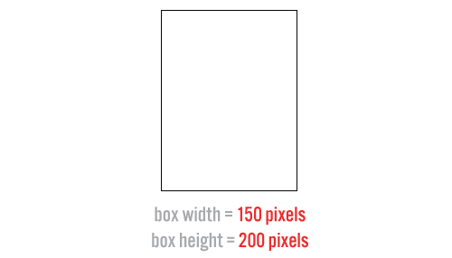
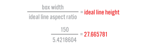
We divide the width of the box by the aspect ratio of the “ideal line” of text which it is to contain, resulting in a pixel value for the height of this line.
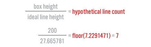
When we divide the height of the box by the height of the ideal line, we arrive at a hypothetical line count—an estimate of how many lines the text is going to have to be broken into to fit snugly within the box.
Since we know the number of characters in our text, we divide it by our hypothetical line count to come up with an “ideal character count” per line of text.
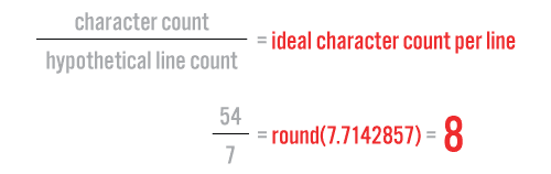
As we will see in the next part, this is a very important value—it becomes a benchmark to help us decide where to split the text into lines.
Coming soon: The slabtype algorithm, Part 3: Iterative line splitting
The slabtype algorithm, Part 1: Background
Algorithms,
Flash,
Graphic Design,
Interactive Design,
Typography,
1/23/08
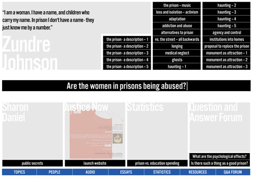
Animator/designer Alessandro Ceglia pointed out to me a few months back that it’s possible that many users of Public Secrets don’t realize that the piece’s visual presentation is almost entirely algorithmic. Once you get beyond the title screen, all visual composition is handled dynamically, and you’ll never be able to take two identical screenshots of the piece. The designer’s statement for the project describes the two main algorithms used in the project: treemaps (an existing solution dating back to 1991) and an original text-layout algorithm which as of this article is dubbed “slabtype.”
Treemaps (which I fell in love with after seeing Martin Wattenberg’s Map of the Market while I was working at Razorfish) are covered extensively elsewhere (description, history, Wikipedia) and are used to generate the overall layout of boxes for each screen of the piece. In this four-part series of posts I’m going to present a graphical breakdown of the slabtype algorithm responsible for laying out the text and quotations which appear inside the boxes (source code will be provided in the final post).
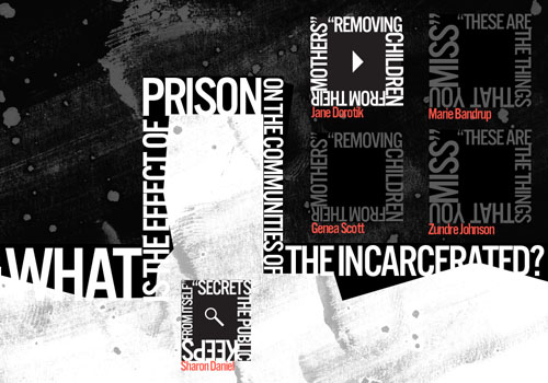
As the design process for Public Secrets began to lead Sharon Daniel and I back towards her original idea of making the treemap algorithm a central metaphor of the piece, it became clear that we could really use some aesthetically pleasing way of dynamically placing arbitrary amounts of text inside a box. Early designs organized the statements of the incarcerated women as collections of titles, but ultimately these approaches were rejected as too index-like and lacking in emotional power.
An early, more index-like design for Public Secrets.
A subsequent design hit upon what later became our “split” view, which runs text along an arbitrary rectilinear dividing line between halves of a binary. The dividing line was shown to organize the space on either side into rectangular blocks in which text was laid out along the borders of squares. The idea was intriguing, and I started writing some pseudocode to work out how to fit the text to the border: the program would make a “best guess” at the relative point sizes needed and then refine the guess iteratively. The algorithm was never finalized, however, as it was clear that the type was too hard to read in this configuration.
The "split" view, featuring text running around the borders of boxes.
Further exploration led to a new tack in which the text associated with a particular box was chopped up and resized into a slab that approximated the shape of its enclosing rectangle. This method seemed to add an urgent quality to the quotes and supported an approach in which the quotes themselves were the primary visual experience of the piece—dovetailing nicely with Sharon’s original intent to foreground the voices of the women.
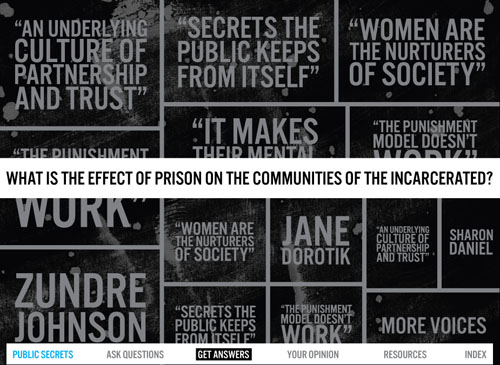
A mockup of the approach that became the model for the slabtype algorithm.
The above screen was assembled by hand in Illustrator and Photoshop, but after Sharon agreed that this approach held promise, I started working on the algorithm itself.
Next: The slabtype algorithm, Part 2: Initial calculations
Introducing “Generous Machine”
Announcements,
1/19/08
"These machines... They must be generous with our needs. They must be forgiving with our errors. They must be eloquent of ourselves."—Grid Farmer Perry, in Chapter Seven of Chroma
Today marks the debut of “Generous Machine,” a freshly minted moniker for this site, and a new domain (generousmachine.com) that points to it. (erikloyer.com will continue to work as well.) I’ve been kicking around the idea of blogging under a title for a few months now, and the right one finally came along over the holidays. For me, this title instinctively evokes my favorite interactive works, and so represents both the best experiences of the past as well as my aspirations for the future. I’ll be returning to developing original content this year—and the “generous machine” will be one standard to be aimed for.
Cheers!
Previous Page 15 of 25 pages Next
Recent Posts
Go InSight: Composing a Musical Summation of Every Mission to Mars (Part 2)
Documentary music is something that’s interested me ever since hearing Steve Reich’s Different …
Go InSight: Composing a musical summation of every mission to Mars (Part 1)
 Two of my biggest interests—music and space—collided happily with the opportunity to join the …
Cited Works from “Storytelling in the Age of Divided Screens”
Here’s a list of links to works cited in my recent talk “Storytelling in the Age of …
Timeframing: The Art of Comics on Screens
I’m very happy to announce the launch of “Timeframing: The Art of Comics on Screens,” a new website …
The prototype that led to Upgrade Soul
To celebrate the launch of Upgrade Soul, here’s a screen shot of an eleven year old prototype …
Categories
3d content
Algorithms
Animation
Announcements
Authoring tools
Award winners
Comics
Comics related
Commissioned works
Database driven
Digital humanities
Electronic literature
Essays
Events
Exemplary work
Experiments
Featured
Fiction
Flash
Flex
Fun
Games
Games related
Graphic design
Highlights
Interactive design
Ipad
Iphone
Jquery
La flash
Miscellaneous
Museum collected
Music
Musicals
Non fiction
Non project
Opertoon
Original content
Original music
Poetry
Remembrances
Scalar
Shockwave
Source code
Stepworks
Tactile
Tools
Typography
User experience
Vectors journal
Viewfinder
Virtual landscape
Wii