Reflections on CES with TunesMap & Gracenote
Miscellaneous, Music, User Experience,
1/9/11
A short aerial hop returned me home last night from Las Vegas and the human anthill that is CES. It’s been 15 years since my last visit to the show (for Inscape and Time Warner, promoting alternative graphic adventure CD-ROMs—DEVO Presents Adventures of the Smart Patrol anyone?), and while the technology on view has obviously changed, the experience of attending the show itself seems largely the same.
Trade shows are always 10,000 decibels of noisy bluster, but while E3 and Comic-Con at least have a general theme (video games, geek culture), CES is so expansive as to be nearly incomprehensible. Obviously I’m missing something, but I have never understood the utility of having such a broad swath of vendors under one roof. How does anyone find anything?
Some of my favorite booths, however, were those for international concerns whose messaging wasn’t as finely attuned to American eyes and ears as that of the typical booth barketeers. The pleasure of ingesting content not engineered precisely for you is one I’m learning to appreciate more as I get older, I think.
Browsing time was limited, however, as my main reason for attending the show was not to buy, but to sell. For the last two years I’ve been working with a startup called TunesMap, brainchild of longtime music supervisor G. Marq Roswell and a small team of music and media professionals, developing UX for a music discovery engine with two main differentiators: 1) delivery of cultural context with music search, in the form of audio-visual search results that integrate the requisite artists, albums and songs with the films, fashion, news, literature, art and comedy that were contemporary with the music’s creation and 2) a deep editorial bench of music experts who can help weave this cultural tapestry out of their own expertise and personal experience (the stories one hears from these guys is one of the most fascinating perks of the job).
Gracenote, creators of CDDB (which is the reason why iTunes magically knows all about the tracks on that CD you’re ripping), is expanding their already impressive reach providing metadata for the worlds of music and entertainment. Seeing TunesMap as complementary to those goals, they kindly invited us to share their booth. As of this writing CES is still ongoing for two more days, but already the response has been very strongly positive.
For me personally the show has also been a great experience—the TunesMap team has been working in largely virtual fashion and it’s always great to see everyone in person. In addition, we’ve been showing the extensive mockups I’ve helped put together for TunesMap and received many positive comments on the UI, which is encouraging. During my last really sustained run at the tech trade shows I was also at a much more junior phase in my career, so it has been fascinating to see the phenomenon this time from a “back room” perspective. The ritualistic nature of deal-making never ceases to fascinate.
I think ritual also holds the key to some of the strangeness CES holds for someone working in the world of UX, which has been so profoundly shaped by Apple over the last decade. As Apple’s dominance in digital culture has increased, so too has it’s particular sheen of design, marketing and presentation. On the dog-eat-dog world of the CES show floor, both the foreign feel of alternate marketing styles and the incessant copycatting of Apple’s recent successes points up exactly how much we’ve been entrained to step in time with the rhythms of the makers of “those fruit computers.”
The real “Duck at the Door” revealed
Miscellaneous,
1/4/08
Happy New Year, all. Things are starting to return to normal around here, so I thought I’d share a bit of an in-joke to get the ol’ blog warmed up again… My daughter got this book as a Christmas present—Chroma fans may be amused (look below the image for an explanation):
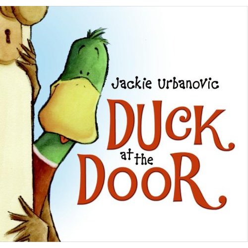
(“Duck at the Door” is the pseudonym of one of the main characters in Chroma. The name actually came from a dream I had in which—you guessed it—a duck arrived at my front door. Trust me, it was all very symbolic…)
Ode to ray-traced spheres and Apple logos
Miscellaneous,
10/26/07
Continuing their excellent “Road to Mac OS X Leopard” series that looks at features of Leopard in historical context, AppleInsider posted this image of the Macintosh II from 1987:
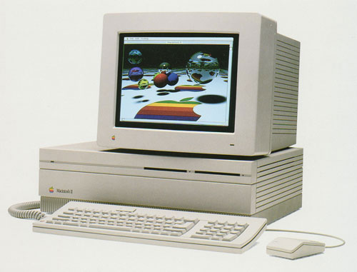
I got chills when I saw this—there is so much bound up in this image for me. I first caught a glance of it on the cover of Macworld magazine in Sawyer’s News in downtown Santa Rosa, while I was still in high school. We had a Mac Plus at home, and I had already spent some time doing experimental work on Macs and Amigas under the tutelage of John Watrous at Santa Rosa Junior College. At that time, many who hadn’t yet fallen under the Mac’s spell were fond of pointing out that the machine didn’t have a color display. Those of us who loved the Mac, however, were able to easily process this criticism as coming from people akin to those who thought black-and-white movies were boring; they just had no appreciation for culture, man!
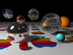
When I first saw the old rainbow Apple logo reflected with raytraced precision in the hovering silver spheres (not rendered on a Mac II, mind you, but on a Cray supercomputer), I felt simultaneously exhilarated and betrayed. I was exhilarated because the image meant that high-end graphics like those I had been seeing in numerous CG animation compilations (Sexy Robot, anyone?) were going to be in reach of a machine I might actually have access to. The feeling of betrayal came from a sense that Apple had somehow caved to the masses by offering color. It felt cheap. I remember wondering if the Mac interface would even work in color! Even the shape of the machine felt like a concession to the lowbrow. A big box? What happened to the elegant, compact all-in-one design, where even the various i/o port icons bore the stamp of greatness?
Not long afterwards, I got to spend some time with the box. The junior college had bought one, and while the machine was not located in the art department, John managed to get me a couple of hours alone with it. I still remember the smell of the room. I started poking around, getting a feel for how color had been worked into the OS. It started to sink in that this wasn’t a betrayal at all, it was where the machine needed to go, that the design intelligence was still there, and in fact now had a (literally!) greater palette through which to express itself.
And then I fired up Digital Darkroom. By that time, I had spent a couple years learning the art of one-bit pixel pushing in MacPaint (to hone my skills, over a few days one summer I dedicated myself to recreating corporate logos from Macworld advertisements in bitmap form). Having accommodated to the on/off world of early Mac image creation, to click on the water droplet tool and be able to—what?—actually smear graphics digitally was nothing short of a revelation. It would be another five years before I got consistent access to a color Macintosh, at The Voyager Company, but this image signaled the imminent arrival of a brave new world in desktop imaging.
Recent Posts
Go InSight: Composing a Musical Summation of Every Mission to Mars (Part 2)
Making music out of the data of interplanetary exploration.
Go InSight: Composing a musical summation of every mission to Mars (Part 1)
Making music out of the data of interplanetary exploration.
Cited Works from “Storytelling in the Age of Divided Screens”
Here’s a list of links to works cited in my recent talk “Storytelling in the Age of Divided Screens” at Gallaudet University.
Timeframing: The Art of Comics on Screens
I’m very happy to announce the launch of “Timeframing: The Art of Comics on Screens,” a new website that explores what comics have to teach us about creative communication in the age of screen media.
The prototype that led to Upgrade Soul
To celebrate the launch of Upgrade Soul, here’s a screen shot of an eleven year old prototype I made that sets artwork from Will Eisner’s “The Treasure of Avenue ‘C’” (a story from New York: The Big City) in two dynamically resizable panels.
Categories
Algorithms
Animation
Announcements
Authoring Tools
Comics
Digital Humanities
Electronic Literature
Events
Experiments
Exemplary Work
Flash
Flex
Fun
Games
Graphic Design
Interactive Design
iPhone
jQuery
LA Flash
Miscellaneous
Music
Opertoon
Remembrances
Source Code
Typography
User Experience
Viewfinder
Wii
Archives
July 2018
May 2018
February 2015
October 2014
October 2012
February 2012
January 2012
January 2011
April 2010
March 2010
October 2009
February 2009
January 2009
December 2008
September 2008
July 2008
June 2008
April 2008
March 2008
February 2008
January 2008
November 2007
October 2007
September 2007
August 2007
July 2007
June 2007